Creating a Consistent Brand Identity: Logos, Typography and Customer Experience
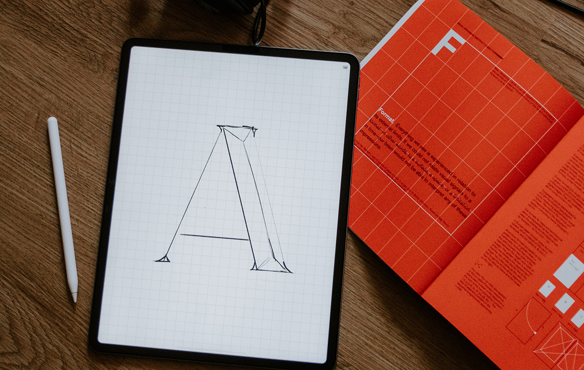
A brand identity needs to work on a shop sign, a phone screen and an invoice, often with different space and production limits. A logo looking impressive in a presentation still needs to remain recognisable when reduced to a small profile image or printed in one colour.
Design trends offer ideas for solving these problems. They are less useful as instructions to replace familiar assets every year. Assess AI tools, motion, minimalism and bold typography against the places customers encounter your business and the work your team needs to produce.
Build an Identity System Before Choosing a Style
Brand identity includes the visual and verbal elements identifying a business. A practical system covers the logo, colour palette, typography, photography and writing style. Guidelines explain how these elements work together across everyday materials.
Start by collecting examples of current use. Include the website, social profiles, packaging, sales documents and physical signage. Mark the places where staff improvise because an approved asset or instruction is missing.
If your website uses one logo, your invoices use an older version and your social accounts use several different colour palettes, organising approved assets solves a more immediate problem than commissioning another set of decorative graphics.
Set Criteria for Evaluating New Ideas
Describe the business’s offer and audience before reviewing design proposals. Identify the associations you want to communicate and the practical constraints, such as multilingual packaging or a long company name.
Translate broad preferences into specific tests. Instead of asking for a modern identity, ask for a wordmark readable on a mobile header and a layout system staff will use for recurring announcements. These requirements give designers something concrete to evaluate.
Use AI for Defined Branding Tasks
AI-assisted image and text tools support exploration and production. Their output still needs selection and review. A collection of generated images does not supply the positioning, asset rules or production files needed for a complete identity.
Separate Exploration from Approved Assets
Use generated imagery to explore composition, lighting or illustration directions before committing to a production approach. Label working concepts clearly and keep approved assets in a separate location.
For example, a retailer exploring a photographic style should compare sample images against actual products and store conditions so the chosen direction does not promise materials, spaces or services absent from the customer experience.
Check the terms of the specific tool and model used. Adobe states Firefly output from features without a beta label is available for commercial projects, subject to applicable terms. Commercial permission alone does not prove an image is unique or suitable as a protected brand asset.
Before approving final files, review names, lettering, product details and similarities to existing designs. Keep a record of the tool, source assets and production decisions so later changes do not depend on recreating an undocumented prompt.
Personalise Messages Without Changing the Core Identity
Personalisation involves choosing relevant content for a particular audience or situation. For example, a business using purchase history to select product information needs rules for matching products to the customer, while a stated language preference provides a direct basis for choosing an email version. Describe the actual input and decision rather than attributing every tailored message to AI.
Keep recognisable elements stable across these variations. Changing an offer or image does not require a different logo or writing style for every audience. Define which parts of a template are editable and which need approval.
Treat Chatbots as Part of the Service Experience
A chatbot’s name, wording and interface contribute to the way a business presents itself. Define the questions the assistant handles and the route to a person for unresolved issues.
Test practical scenarios before launch. Ask about an unavailable product, a refund and an ambiguous service request. Review the answer for factual accuracy as well as tone. A friendly response giving the wrong policy creates a service problem rather than a useful brand impression.
Use support records to identify recurring questions for design research. These records help reveal confusing descriptions or missing information. They do not replace interviews with customers or justify changing the visual identity whenever a dashboard metric moves.
Give Motion and Interaction a Specific Purpose
Motion extends an identity through animated logos, transitions and interface feedback. Define how movement supports the task. An animation confirming a completed action serves a different purpose from a decorative sequence delaying access to a page.
Plan Motion Alongside Static Design
Specify movement rules in the identity guidelines. Include pacing, transitions and the relationship between animation and typography. Provide a static version for places where motion is unavailable or inappropriate.
When a logo animation appears before a video, test the sequence with the actual opening content so the viewer receives the message promptly rather than watching several seconds of branding before learning anything useful.
For interactive websites, support reduced-motion preferences and provide a way to avoid unnecessary movement. W3C’s guidance on interaction-triggered animation explains the risk of dizziness and nausea for some users. Decorative motion should not prevent someone from reading or completing a task.
Learn from Documented Brand Systems
- Nike Run
PORTO ROCHA’s Nike Run case study describes a RUNSWOOSH mark supported by typography, voice and motion. The useful example is the relationship between these elements within one system, rather than a claim about animation automatically improving sales. - Google’s identity family
Google’s 2015 identity project included a wordmark, a compact G and animated dots for interactive states. This historical example shows how related assets serve different sizes and functions without requiring a wholly different identity for each placement. - Coca-Cola and Marvel packaging
Coca-Cola’s 2024 Marvel campaign used QR codes on limited-edition packaging to provide access to AR character animations. This was a specific campaign application, rather than evidence every packaged product needs an augmented reality experience.
Choose Interaction Around a Customer Task
A product visualiser, colour selector or venue tour gives a visitor something to inspect. Define the question the experience answers before choosing AR or VR as the format.
Compare the interactive version with a simpler alternative. A clear set of photographs and dimensions deserves consideration before commissioning a 3D viewer. Budget for updates when products, layouts or supported devices change.
Connect Digital Design with the Physical Experience
Customers encounter the same business through booking pages, payment confirmations, packaging and conversations with staff. Review the sequence rather than judging each item as an isolated design exercise.
Check the Handover Between Channels
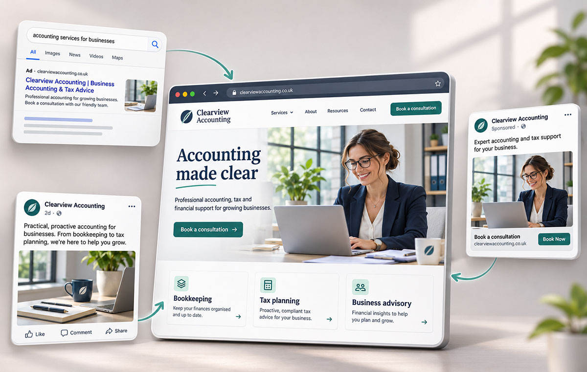
Follow a typical customer journey from an advertisement to an enquiry or purchase. Check names, prices and product descriptions at each step. The wording on an order confirmation should make sense alongside the offer shown before payment.
For a service business, compare the appointment page with confirmation emails and arrival instructions. For a retailer, compare the website’s product photography with the item and packaging delivered. Record differences requiring a content correction separately from differences requiring a design change.
A customer booking through a polished website still needs clear instructions for finding the premises, so include the confirmation email and physical arrival signs when reviewing the identity across the complete service experience.
Test Personalisation Against Practical Limits
Personalised communications need accurate inputs. Ask how a customer corrects a language preference or changes an interest before building automated variations around those details. Avoid promising a different level of service to each segment unless the operation supports the promise. Review customer-facing wording with the team responsible for delivery. Design consistency includes the relationship between a message and the service received.
Use Minimalism to Solve Reproduction Problems
A simpler logo reduces the number of details competing for space. This helps when the mark needs to appear at small sizes, but simplicity does not automatically create recognition, trust or a timeless identity.
Test the Mark in Real Formats
Review the logo at the size used in a browser tab, social profile and mobile header. Print a one-colour version on ordinary office equipment. If the business uses embroidery, engraving or vehicle graphics, request samples appropriate to those production methods.
When a symbol loses an important detail at small sizes, ask the designer for a controlled small-format version rather than allowing staff to redraw the mark independently each time a production problem appears.
Keep useful distinctions. Removing every unusual feature risks producing a mark similar to many others in the category. Compare proposed designs with competitors and explain which existing elements customers already associate with the business.
Define Adaptations in the Guidelines
Provide approved horizontal, stacked and compact arrangements where needed. Specify minimum sizes and clear space. Show examples on light and dark backgrounds alongside cases where the logo becomes difficult to read.
A simplified mark also needs supporting elements. Typography, image treatment and layout provide identity when the logo occupies little space. Review a complete page or package before judging a logo in isolation.
Build Colour and Typography Around Readability
Bold colours and expressive type offer many possible directions. Avoid treating a particular hue as a universal promise of trust, optimism or creativity. The surrounding colours, imagery and wording change how the design reads.
Give Colours Defined Roles
Specify primary colours, supporting colours and approved combinations. Explain which colour identifies a main action and which backgrounds suit longer passages of text. Include practical print specifications alongside digital values.
For ordinary digital text, WCAG’s Level AA contrast criterion requires at least 4.5:1. Qualifying large text needs at least 3:1. Logos have an exception under this criterion, but nearby navigation and body copy still need readable combinations.
Test the palette on actual pages rather than a row of swatches. A bright accent suitable for a large graphic often needs a different treatment behind small text. Include error messages and form controls in the review.
Choose Typefaces for the Content You Publish
Rounded sans-serif typefaces are one option rather than a default requirement for an approachable identity. Compare candidate fonts using actual headlines, prices, addresses and paragraphs. Check the language characters your business needs.
For example, a typeface working well in a short English headline still needs testing with longer German words and accented characters if both languages appear in customer communications, because the resulting spacing affects everyday layouts.
Limit decorative treatments to uses where they remain readable. Provide body-text styles and fallback fonts for office documents or email systems. Confirm licensing covers the intended uses before distributing font files to staff or suppliers.
Evaluate Colour and Type Together
Create examples showing an advertisement, a service page and a routine document. Review the hierarchy of information in each. Customers should distinguish a heading, explanation and next step without relying on every element being large or brightly coloured. Record the reusable styles in templates. A defined heading scale and a few approved layouts reduce the need for staff to improvise when producing the next announcement or price list.
Make Brand Claims Match Observable Actions
Brand authenticity becomes a practical issue when a business describes how products are made or how customers receive support. Specific information gives readers something to assess. Broad claims about caring or making a difference leave the work unexplained.
Use Stories with Verifiable Detail
An origin story should explain the people, problem and decisions behind the business without inventing a dramatic history. Product stories need details about the work involved. Customer stories need permission and an accurate account of the experience.
Show the limits as well as the benefits. If a handmade item varies in appearance, explain the expected variation and illustrate the range. Do not turn an avoidable defect into a story about personality or imperfection. When a business makes an error, explain the correction in plain language. Assign someone to update the relevant product page, policy or customer communication so the explanation is reflected in later interactions.
Define the Evidence Behind Values
A claim about personal service should identify how customers reach support. A claim about local production should explain which work happens locally. Ask the responsible team to approve the description before placing the promise across packaging and campaign materials.
Keep an evidence record for important claims. Include the wording approved, the source supporting the statement and the date a review is due. This gives designers and writers a reliable reference when producing new materials.
Describe Environmental and Sourcing Choices Precisely
Green imagery and natural-looking packaging do not demonstrate an environmental benefit. Separate the visual style from the product claim and identify the evidence needed for each statement.
Explain Packaging Materials and Disposal
Replace an unsupported phrase such as eco-friendly packaging with a specific description of the material or change. Distinguish the product from the packaging and identify the components covered by a claim.
The UK’s Green Claims Code calls for truthful, clear and substantiated claims, with relevant information about the product’s full life cycle. Do not present a change to one component as proof the whole product has a lower environmental impact.
If disposal depends on a particular collection service or treatment process, include the relevant conditions beside the instruction rather than leaving customers to infer the correct route from a leaf symbol or green colour scheme.
Connect Responsible Sourcing with Documentation
Ask suppliers for records supporting statements about materials and working conditions. Define the products and suppliers covered. If only part of a range meets a particular requirement, make the boundary clear.
Keep certification names and symbols tied to their actual scope and permission. Review claims when suppliers change rather than carrying old wording into a new packaging run. Give the person approving artwork access to the supporting records.
Commission a Branding Agency with Deliverables in Mind
An agency brief should identify the business problem and the materials required to solve the problem. Examples include inconsistent branch signage, an identity difficult to use on mobile or a product range with confusing names.
Agree Research and Decision Responsibilities
Share existing assets and customer feedback before the design stage. Ask the agency to explain how research will inform the proposals. Name the person approving decisions and identify the teams needing input on production or service claims. Compare proposals through the agreed criteria rather than collecting an unrestricted list of personal preferences. Consolidate feedback into one response explaining the problem to address. Ask for the reason behind a design choice before requesting a replacement.
Specify the Handover
Agree the required files and templates before work begins. A useful handover includes editable master artwork, appropriate export formats, colour specifications and guidance for everyday applications. Include motion files and static alternatives if animation forms part of the project.
Request examples using the documents staff produce most often. Test a social post, presentation and invoice with actual content. Check someone outside the design team understands the templates without needing to reconstruct the original presentation.
For a business preparing to add locations or product lines, ask the agency to demonstrate the naming and layout rules with a realistic future example so expansion follows a defined system rather than a new design exercise each time.
Budget for Rollout and Maintenance
Separate design fees from printing, signage, website changes and asset replacement. Record which items change at launch and which change when existing stock runs out. Prioritise materials carrying inaccurate information or causing customer confusion.
Assign an owner to the approved asset folder and record the current version of each template. Schedule a review after staff have used the system on real work, then correct missing instructions or recurring production problems in the guidelines.