3 Successful Rebranding Case Studies from Brands Over 100 Years Old
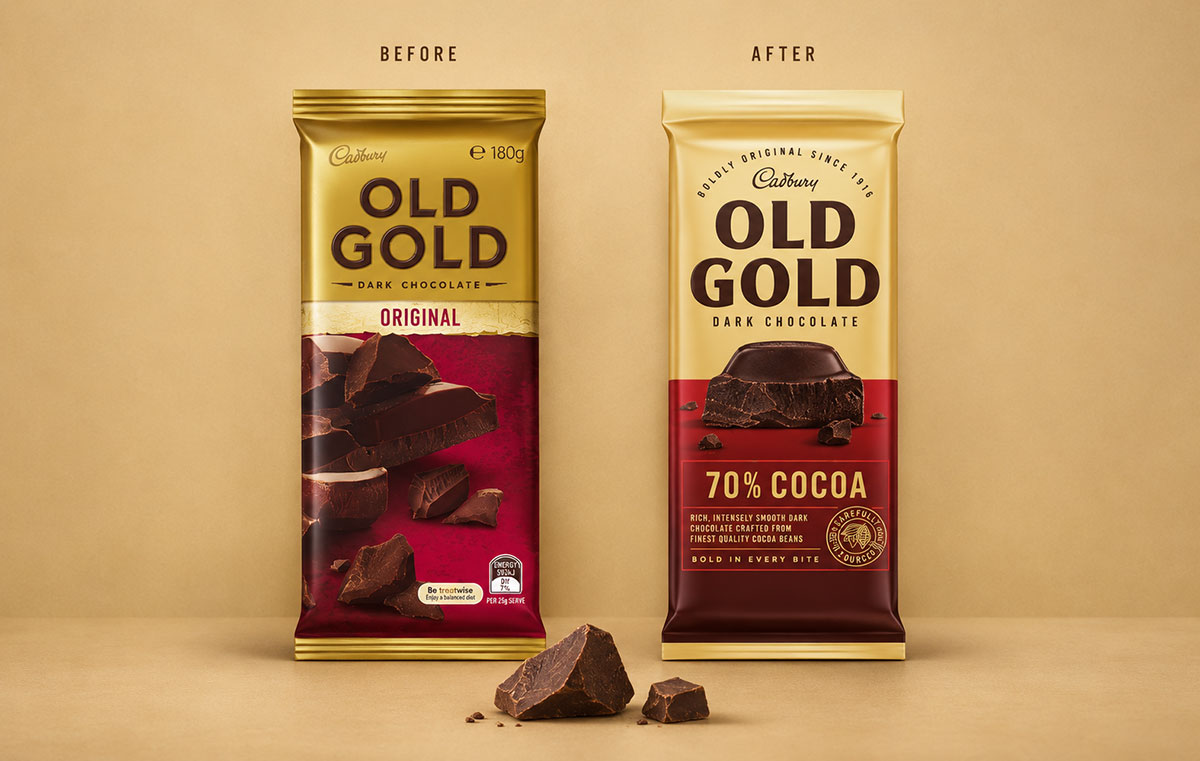
Cadbury Old Gold was about 104 years old when it redesigned its packaging to appeal to younger Australian shoppers. According to the Design Business Association’s case study, Old Gold attracted 9% more younger buyers within 12 weeks of the new packaging becoming available in stores. The new pack still looked like Old Gold, but it made the thick pieces of dark chocolate that regular customers already knew much easier to see.
Swiss brewer Eichhof and British fashion house Burberry also renewed their brands well past the century mark. Eichhof used a familiar squirrel to tie together a sprawling beer range while Burberry put its outerwear back at the centre of the brand and changed how it sold. Each case offers a different way to judge the results, from the age of the shoppers buying a chocolate bar to the share of revenue a fashion house earns through its own retail business.
Cadbury Old Gold made its chocolate the focus of the pack
Old Gold dates back to 1916 in Australia. Many consumers told the brand that they first tasted dark chocolate when a parent or grandparent gave them Old Gold. That association gave it a place in family shopping habits, but it also helped explain why the brand felt aimed at older people. Before the redesign, one in three people in the brand’s research said they would rule out buying it. Read the full Old Gold award entry.
Design agency Bulletproof gave the chocolate chunk more space on the front of the pack, using the image to show the thickness of the chocolate and the amount of filling or other ingredients in each piece. Someone encountering Old Gold for the first time could get a sense of what distinguished the bar from the products around it before reading the flavour description.
The designers kept the gold and built on the split layout of the previous packaging. They updated the lettering and used colour to distinguish the varieties. Keeping the layout consistent made it easier for shoppers to find a favourite while giving Old Gold a format it could reuse for new products. That mattered because range expansion was already part of the brief. Old Gold launched three new products two months after the redesigned packs arrived.
Did younger shoppers buy it?
The project’s award entry reports 9% growth among younger buyers and 4% growth among core buyers within 12 weeks. That second figure matters because the company wanted to reach people who had overlooked the brand while retaining the shoppers who already bought it. Reporting the two groups separately shows more about how the redesign performed against that brief than a single figure for total sales.
Fifteen months after launch, the entry reported about 336,000 additional households buying Old Gold. It also recorded an 8.5% rise in average price in 2020 alongside reduced reliance on promotions. The household figure shows that the buyer base expanded and the pricing figures add context about how the brand was selling during the period. The case study covers a rollout that also included new products, so those later figures capture what happened to the business as the redesigned range reached shoppers. See the packaging and results in the Design Effectiveness Awards case study.
Eichhof used its old squirrel to bring 13 beers together
Eichhof had been brewing in Lucerne for more than 185 years when its new identity appeared in 2021. Its 13 varieties had accumulated inconsistent designs and the brand was losing sales volume and market share. On the shelf, Eichhof needed to solve two problems at once. Shoppers had to be able to recognise which beers belonged to the brewery and still tell the different varieties apart.
Pearlfisher redrew a squirrel that had been part of Eichhof’s identity since the 1960s. It kept the brand’s yellow, redesigned the lettering to suit the squirrel and turned the animal into a repeating motif on the cans. Lucerne artist Amadeus Waltenspühl contributed black-and-white illustrations to the packaging. The shared symbol gave Eichhof a recognisable feature it could repeat across the range while the illustrations and touches of colour gave individual beers room to look different. See Creative Review’s coverage of the Eichhof redesign.
How did Eichhof perform against other Swiss beers?
The Design Business Association reported that Eichhof’s sales volume grew by 4.7% within six months of the redesign while the Swiss beer market contracted by 2.9%. Volume measures how much beer sold, so the rise represents more beer purchased. The market comparison also puts the reversal in context. Consumers were buying less beer across the category while Eichhof was selling more. Read the Eichhof Design Effectiveness Awards case study.
A category benchmark helps rule out one simple explanation for a sales increase: a rising market lifting competing brands at the same time. To estimate the share of growth attributable to packaging, a retailer or brewer would also need evidence on changes such as distribution, shelf position and promotion. A redesign that rolls out to comparable stores at different times gives a brand a way to make that comparison.

Burberry brought its outerwear back to the centre of the business
Burberry was 150 years old in 2006 when Angela Ahrendts took over as chief executive. Working with Christopher Bailey, she refocused the business on British heritage and products such as the trench coat. The company also invested in reaching younger customers online and put more of its retail business under its own control. Read the London Business School case study on Burberry’s strategy.
Direct retail gave Burberry more control over which products people encountered first and how they were presented. A department store buying a selection of products for resale could decide how much space to give Burberry and which items to highlight. In its own stores, Burberry could give outerwear a prominent position and show how it fit alongside the rest of the collection. That made decisions about distribution part of how the company put its brand positioning into practice.
Annual revenue rose from £742.9 million in the 2006 financial year to £2.33 billion in 2014. The London Business School case study puts retail’s share of revenue at 43% in 2006 and 70% in 2014. The shift in where the money came from tells part of the story that the headline revenue figure misses. Over those eight years Burberry changed its product mix, opened stores and built its digital business, so the revenue figures describe a company-wide turnaround.
How to measure a rebrand when customers already know the name
Old Gold’s brief was to reach a younger audience, so the age of its buyers was a better early measure than brand awareness alone. If a brand wants to do the same, it can record purchase rates for the target age group and existing customers before launch, then track both groups after the change. A rise among younger shoppers has a different commercial meaning if purchasing among regulars falls at the same time.
For a range redesign like Eichhof’s, test recognition and navigation separately. Give shoppers a shelf mock-up and ask them to point out every product they think belongs to the brand. Then ask them to find one specific variety. If they spot the family quickly but take longer to find the product they came for, the shared branding is doing its job while the cues that distinguish one variety from another need work.
With a broader repositioning like Burberry’s, measure the changes the business makes to put the new positioning into practice. A brand investing in its own stores can track direct retail’s share of revenue alongside sales at comparable stores and the performance of the products it has chosen to feature. Revenue from new locations shows what expansion added. Sales at comparable stores show how the offer performed in places where customers already had a chance to buy it.