Logo Design Tips for a Memorable Brand
Before approving a logo, place the design in a website header, a social profile image and a business card layout. A design which looks clear on a large presentation slide still needs to work in the places your customers will see.
Check whether the business name is readable, the symbol survives at a small size and the design works against different backgrounds. These practical tests give you a better basis for choosing than personal preference alone.
Give Your Logo a Clear Job
Understand the Wider Brand Identity
Your brand identity includes your logo, colours, typography, imagery and tone of voice. These elements shape how you present the business across your website, packaging, advertising and other materials.
The logo identifies the business within this wider system. Avoid expecting one symbol to explain every service, express every company value and communicate your entire history.
Write a short brief before starting the design. Describe your customers, your main offer and the impression you want to create. Include practical requirements such as a long business name, bilingual wording or frequent use on uniforms.
Decide What the Design Needs to Communicate
Choose a few useful qualities rather than a long list of positive adjectives. “Approachable and straightforward” gives a designer a clearer direction than “professional, innovative, premium, friendly and dynamic.”
Connect those qualities to specific decisions. A business with a long name might prioritise readable lettering over a detailed symbol. A retailer using small product labels needs a version which survives at those dimensions.
Your logo does not need a literal picture of your service. Explore a wordmark, a symbol or a combination of both. Judge each approach against the brief and intended uses.
Research the Category Without Copying the Competition
Look for Repeated Visual Choices
Collect examples from direct competitors and related businesses. Note repeated colours, type styles and symbols. A page full of similar roof outlines or leaf icons highlights an opportunity to explore another direction.
Separate useful category signals from habits. Familiar visual choices provide context, but copying the same arrangement makes differentiation harder.
Compare the names as well as the graphics. Two businesses with similar names and similar lettering deserve particular attention during your review.
Gather References for Specific Reasons
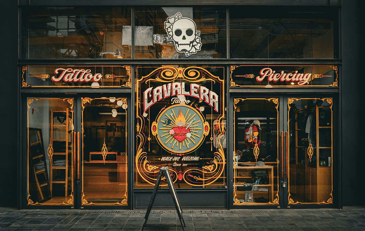
Look beyond existing logos. Signs, architecture, packaging and editorial design offer references for proportion, spacing and lettering.
Record why each example interests you. “The name stays readable at a small size” is useful feedback. “Make ours look like this” encourages imitation without explaining the underlying need.
Keep the reference collection manageable. A few examples with clear observations give a designer more direction than dozens of unrelated images.
Choose Shapes, Type and Colour Together
Start With the Name and Main Shape
Explore the overall arrangement before polishing small details. Compare a wordmark with a symbol-and-name version. Try a horizontal arrangement and a more compact alternative.
Begin in one colour to assess the lettering and silhouette without relying on effects. Add colour after the basic design works.
Remove details which disappear at the intended size. Fine lines, small decorative marks and tightly packed lettering deserve closer inspection. Simplicity should improve clarity rather than strip away every distinctive feature.
Check Typography With Your Actual Business Name
A typeface sample gives limited information about how your name will look. Test the full name, including punctuation, capitalisation and any secondary wording.
Examine letter spacing and easily confused characters. Ask someone unfamiliar with the business to read the name without help. If several people misread the same letters, investigate the design rather than explaining the intended reading.
Compare typefaces using the same word and similar sizes. Consider whether the lettering suits your intended tone and works alongside the fonts planned for your website or printed materials.
Keep a tagline separate during early testing. A long line of small text creates another readability problem and complicates use in compact spaces.
Choose Colour in Context
Avoid treating colour associations as fixed rules. Instead of choosing blue solely to suggest trust or green solely to suggest environmental responsibility, assess the complete design and the market around your business.
Place colour options on realistic backgrounds. Check the website header, packaging colour and photography you expect to use. A pale mark against a pale background needs a different treatment.
Prepare a full-colour version and suitable single-colour alternatives. Test a light version against dark backgrounds as well as a dark version against light backgrounds.
For websites, distinguish the logo from surrounding content. WCAG 2.2’s minimum text-contrast criterion exempts text within logos and brand names. The exemption does not extend to ordinary website text merely because your brand guidelines specify the colour. Choose readable combinations throughout the page.
Test Recognition, Readability and Flexibility
Review the Logo at Real Sizes
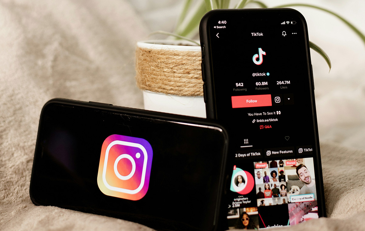
View the design at the size expected in a mobile website header, social profile and printed label. Do not rely entirely on enlarged mock-ups.
For a circular profile image, check the crop and surrounding space. For a website header, consider how much room the logo leaves for navigation.
Print a sample where practical. Examine whether thin details remain clear and whether small secondary text is worth retaining.
A vector file preserves sharp edges when resized. The design still needs a small-size test. Scaling a detailed illustration down does not guarantee the details remain distinguishable.
Use Variations With a Shared Identity
A horizontal logo, stacked arrangement and compact symbol serve different spaces. Develop these as an approved set rather than improvising a new version for each channel.
Keep recognisable features consistent across the set. These might include the lettering, proportions, symbol or colour treatment.
Do not force a long business name into a tiny square. Test a compact alternative alongside the full version and decide where each belongs.
Aim for Longevity Through Practical Choices
No design process guarantees a timeless result. Focus on decisions which support continued use.
Ask whether the logo depends on a fashionable effect or an unusually narrow interpretation of your current offer. A mark built around one product deserves scrutiny if you expect to expand into other categories.
Distinguish preference from a functional problem. A trend becoming less popular does not automatically make a readable, recognisable logo unsuitable.
Ask for Feedback You Are Able to Use
Give Reviewers Specific Tasks
Show a small selection of developed options rather than every early sketch. Explain the brief, then ask questions tied to the design’s purpose:
- What business name do you read?
- Which details remain clear in the smallest version?
- Does the design resemble another business you know?
- Which option best fits the intended tone, and why?
- Where does the design become difficult to use?
Include potential customers where practical. Colleagues and designers offer useful perspectives, but they bring different knowledge and preferences.
Record recurring observations. A repeated readability issue deserves more attention than one person’s dislike of a particular colour.
Refine Against the Brief
Group feedback into practical issues, questions about fit and personal preferences. Address practical problems first.
Ask the designer to explain the reasoning behind revisions. Increasing letter spacing or simplifying a symbol should solve an identified problem.
Avoid combining everyone’s favourite feature into one design. Review the whole composition after each meaningful change. An improved symbol still needs to work with the name, spacing and colour choices.
Prepare the Logo for Everyday Use
Request the Right Files
Keep an editable vector master. Vector artwork uses paths and shapes, allowing resizing without the pixelation associated with enlarging a raster image. SVG is a vector format intended for web use.
Request exports suited to your actual channels, including transparent-background image files where needed. A screenshot of the logo is a poor substitute for a proper file package.
Check the exports before accepting the handover. Open each version and confirm the wording, colours and background treatment match the approved design.
Write a Short Usage Guide
Document the approved arrangements, colour values and background options. Include enough surrounding space to prevent nearby text or graphics from crowding the logo.
Set a minimum size after testing rather than choosing an arbitrary measurement. Show examples of unsuitable use, such as stretching the artwork or placing a dark version over a dark photograph.
Make the approved files easy for employees, suppliers and external designers to find. Clear filenames help distinguish full-colour, light, dark and compact versions.
Roll Out Changes Deliberately
List the places requiring an update, including your website, social profiles, email signatures, invoices, signage and printed materials.
After launch, collect examples of practical problems. Address a difficult background with an approved colour variation or a cramped layout with the compact version.
Keep the master artwork stable between deliberate reviews. Update the usage guide when you approve a new application so the next person working with the logo has the correct instructions.